Overview
The goal of this project is to learn about open source data visualization tools. My aim is to complete the challenge. This challenge.
Test Project
I wanted to do a little getting my feet wet before working with a massive data set, just to get involved in the idea of visualization.
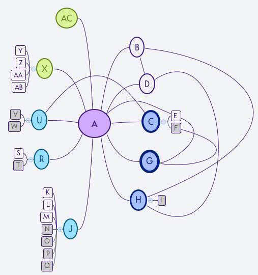
I created the above, very basic, visualization using XMind. The above is an anonymized version of my polycule. The character polycule from a popular poly comic, Kimchi Cuddles, inspired me to make my own polycule diagram a while back. Now, I’d like to create a nicer visualization for this as a test project for the visualization challenge.
I found this pretty diagram (of character co-occurrence in Les Mis) through D3.js, and I thought that it might work out well as a test project. Go go gadget learning!
Test Project Progress
- Late on September 22 2016
- Force-Directed Graph>About
- Checked out GithubGist, which I learned from asking sen is kind of like pastebin, but attached to your GitHub
- September 26
- visualization
- added the Bl.ocks extension for Chrome
- decided to test the app using the code that’s offered with the Les Mis data
- attempted just copying in the Index page and then adding the blocks.org URL, but that came up with a 404 error
- tried the blocks extension, and it said “file not found” (same happened when I tried with just the JSON, which makes sense)
- added the JSON file to the index file using Add File button, tried the block extension and same error
- tried making the Gist public (from secret previously) and that also didn’t help
- checked in with sen, comparing the original gist with mine, and learned that titles of the files are actually more filenames than titles, and that I had done it wrong (I had just called them INDEX and JSON)
- once I updated the filenames, everything worked just fine
- the data
- the biggest roadblock I have starting out, given the tools, isn’t actually that I can’t graph the data, rather, I’m not sure how to work with the data that I have
- there was a question about this in the GitGist I was using in the above example, someone who wrote “im novice in d3. can someone tell me how you define node , group , value and target.” – using this comment (that was never replied to) as a starting point, I headed back to the D3 site and its associated documentation git
- luckily, they have a lot of tutorials, so I started out looking here, and here – unfortunately, they weren’t super relevant
- so I tried looking up the actual data set used for this graph, which gave me good news and bad news (data set found here: this chart is pulled from data that are WAY more complicated than my data are, and, mathematically, doesn’t give me a lot of information on how to group my (much simpler) data set in order to make it compatible with the graph format I’m looking at
- I also found this, however, an updated data set based on the original (found in the Stanford GraphBase – which led me to think that maybe I need to chart my data, and then parse it to get it into an acceptable format
- visualization
- later on September 26
- after talking to sen about all kinds of things, I decided just to enter the data manually into JSON because the other things I had considered doing were less applicable overall to the data visualization challenge
- I re-created the same gist that I created above with the test code (copy and paste), changed “miserables.json” in the index file to “polycule.json”, and attempted to modify the JSON for the polycule data by creating a node for each node in the Xmind file, and then assigning the following values:
- each individual branch on the polycule gets its own group
- between me and my direct “child” nodes:
- 1: my pets; 2: my closest partners; 3: my more distant local partners; 4: my long-distance partners; 5: my platonic significant others
- each relationship involving an other-than-human animal is assigned a value of 1
- between my “child” nodes, each relationship involving an other-than-human animal is assigned a value of 1, all other relationships are assigned a value of 2
- copied and pasted into gist
- generated chart through bl.ocks chrome extension, but it came up blank
- ran the JSON through a validator, found two errors, and when I corrected them: IT WORKED! I MADE DIS!
- NOTE: I realized after I generated the graph that the logic of a force-directed graph actually doesn’t work at all for a polycule. BUT STILL. Learning! and pretty.
- Micki Kaufman Workshop – Gephi, September 30, 2016
- I did this little practice project during an SCDS Demystifying Digital Scholarship workshop with Micki Kaufman, who worked a bit with this software during the two hour session, and I played with this while Micki talked.
- what I did:
- download Gephi
- watch Micki’s demo (sorry – that I can’t recreate)
- import data from Text Wrangler into Excel (copy and paste)
- Text to Columns
- Remove superflous characters ” and } (find and replace)
- try to import to Gephi, crash Gephi
- save as CSV
- Import to Gephi
- used this resource from the Gephi git to create an initial render
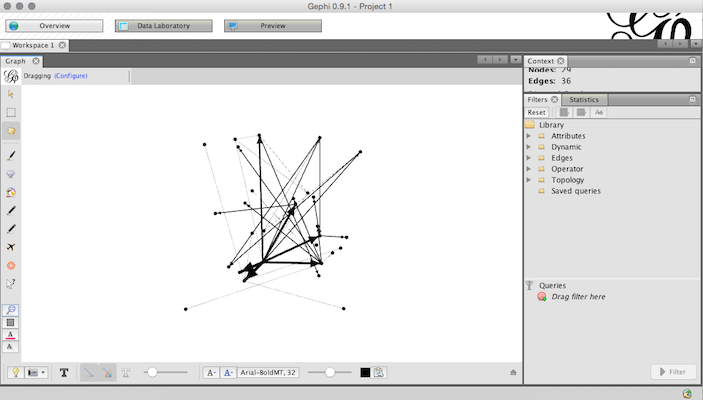
I decided to play with Gephi because of the conceputal flaws in using force-directed graphs to chart polycule data from a politicized perspective. So far, it seems very usable, and I will be able to create something pretty, and perhaps less conceptually flawed, if less 3D and interactive than with the bl.ocks app.
Actual Visualization Challenge
